Website UI/UX Best Practices (2026): Design Rules That Increase Trust, Speed & Conversions
In 2026, “good design” is not just about colors and fancy graphics. A great website UI/UX means your site feels clear, fast, modern, and trustworthy—especially on mobile. If users struggle to read, scroll, understand your offer, or contact you, they leave. That directly affects your business: fewer leads, higher bounce rate, and weaker SEO performance.
UI (User Interface) is what people see: layout, buttons, cards, colors, typography. UX (User Experience) is how people feel and behave: clarity, ease, trust, speed, flow.
This guide gives you professional UI/UX best practices that actually increase:
- trust and credibility
- conversion rate (WhatsApp, forms, calls)
- engagement time
- SEO performance (because good UX improves user signals)
If you’re building premium websites and web applications, see: Web Applications Services

Quick Definition: What Makes a Website “Good UX”?
A website has good UX when users can:
- understand what you do in 5 seconds
- find what they need without thinking
- easily contact you (WhatsApp/contact)
- trust you (proof + structure)
- use it smoothly on mobile
- load pages quickly without frustration
Good UX is not “extra.” It is the foundation of conversions.
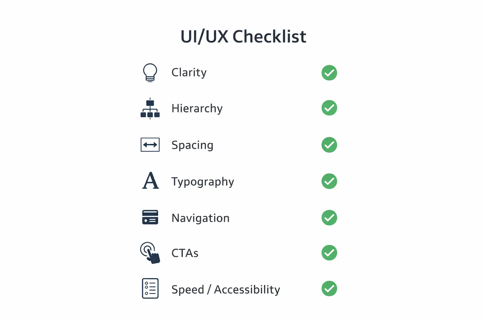
The UI/UX Checklist (Professional Standard)
A modern website UI/UX system has 8 pillars:
1) Clarity (messaging) 2) Visual hierarchy (what stands out) 3) Layout and spacing (premium feel) 4) Typography (readability) 5) Navigation (structure) 6) CTAs (conversion) 7) Forms (lead capture) 8) Speed + accessibility (quality)
1) Clarity: Users Must Understand You in 5 Seconds
The top reason visitors leave: confusion.
Best practice for clarity (homepage hero)
Your hero section should include:
- a clear headline: what you do
- a short supporting line: who you help + outcome
- a CTA button: WhatsApp/Contact
- a trust line: proof (portfolio/projects)
Bad example
“We provide innovative solutions for businesses.”
Good example
“We build fast, SEO-ready business websites and web applications that generate leads.”
Clarity converts. Creativity comes after clarity.
2) Visual Hierarchy: Guide the Eye Like a Sales Funnel
UI/UX is a visual conversation. Users scan, they don’t read.
Your design must guide attention:
- big headline first
- then supporting line
- then CTA
- then proof
Visual hierarchy rules
- one H1 per page
- strong contrast for headings
- CTAs should stand out (not hidden)
- important content should be above the fold
Avoid making everything look equal. If everything is bold, nothing is important.
3) Layout & Spacing: Premium Feel Comes From Structure
Most websites look “cheap” because of spacing issues.
Best spacing rules
- consistent section padding
- consistent card padding
- clean margins on mobile
- alignment should be intentional
Common mistakes
- text touching screen edges
- random padding per section
- too many small elements together
- no breathing space
A premium UI is mostly spacing + typography.
4) Typography: Readability = Trust
Typography decides whether users can comfortably consume content.
Practical typography best practices (2026)
- body text should be easy to read without zoom
- headings should be bold but not oversized
- line-height should be comfortable
- use limited font styles (avoid too many)
Paragraph rule (mobile-friendly)
Keep paragraphs short:
- 2–3 lines max
- add bullet points for clarity
If your users can’t read comfortably, they won’t convert.
5) Mobile-First UX: Most Users Will See Mobile First
Mobile-first means:
- design for mobile screen first
- then enhance for desktop
Mobile UX rules
- minimum tap target size for buttons
- enough spacing between clickable items
- sticky CTA can help (WhatsApp)
- avoid heavy popups on mobile
- keep navigation simple
A site that looks great on desktop but weak on mobile will fail in 2026.
6) Navigation: Simple Structure Wins
Navigation must help users reach key pages quickly.
Best navigation structure
- 4–6 main links max
- add “Contact” clearly
- add “Services” dropdown only if needed
- keep header height reasonable
Avoid
- too many menu items
- complicated multi-level menus
- hidden contact options
7) CTAs: Your Website Must Tell Users What to Do Next
A website without strong CTA is like a shop without a cashier.
Best CTA placements
- hero (above the fold)
- after services section
- after portfolio/proof section
- end of page
Best CTAs for India
WhatsApp usually converts fastest.
Example: 👉 WhatsApp: Chat on WhatsApp 👉 Contact: Contact page
Also add proof links near CTA:
8) Forms: Most Lead Funnels Fail Here
Forms often reduce conversions if they are hard to fill.
Best form UX practices
- keep fields minimal (Name, Phone, Requirement)
- input height should be comfortable
- show clear error messages
- show success confirmation
- reduce friction (no long forms)
Smart approach
If WhatsApp is primary CTA, keep form as a secondary option.
9) Trust Signals: UX Is Also About Credibility
Even if your service is amazing, users need proof.
Best trust elements
- portfolio/case studies
- demos and screenshots
- testimonials
- process transparency
- clear about page
- clear contact details
- privacy policy and terms pages (for corporate trust)
If you have demo systems:
10) Speed Is UX (Core Web Vitals)
A slow website feels unprofessional.
Speed UX rules
- optimize images (WebP)
- lazy-load below fold
- avoid too many scripts
- keep animations light
- use CDN hosting (Vercel etc.)
Speed affects:
11) Accessibility: Better UX for Everyone
Accessibility improvements also improve general UX:
- proper contrast
- readable font size
- keyboard navigation support (for forms)
- clear labels
- avoid tiny links
A site that is accessible is usually more usable.
12) UI/UX Mistakes That Kill Conversions
Avoid these: 1) confusing headline (no clarity) 2) no CTA above fold 3) too much text without structure 4) inconsistent spacing 5) too many fonts/colors 6) weak proof section 7) slow pages 8) popups that block mobile experience
Practical UI/UX Upgrade Plan (For Any Business Website)
If you want to improve your current website, follow this:
Step 1: Fix the homepage hero
Clear headline + CTA + proof.
Step 2: Simplify navigation
Keep it clean and easy.
Step 3: Improve service pages
Separate service pages rank better and convert better.
Step 4: Add proof
Portfolio, demos, screenshots.
Step 5: Improve conversion flow
WhatsApp CTA, contact page, short form.
Step 6: Improve speed
WebP images, reduce scripts, lazy-load.
If you need professional website development and web apps: Web Applications Services
Need a Premium UI/UX Website That Converts?
If you want a modern UI/UX refresh or a new premium website built for conversions, we can help.
👉 WhatsApp: Chat on WhatsApp 👉 Services: Web Applications Services 👉 Portfolio: View our work 👉 Contact: Contact page
FAQs
1) What is the difference between UI and UX?
UI is the visual interface (design, buttons, layout). UX is the overall experience (clarity, flow, ease, trust).
2) How do UI/UX improvements help SEO?
Better UX improves engagement, lowers bounce rate, and improves user signals which support SEO performance.
3) What is the #1 UI/UX improvement for conversions?
Clear headline + strong CTA above the fold + proof near the CTA.
4) How many CTAs should a page have?
Typically 3: one in hero, one mid-page, one at the end.
5) What is best CTA for Indian service businesses?
WhatsApp is often the highest converting CTA, supported by a contact page form.